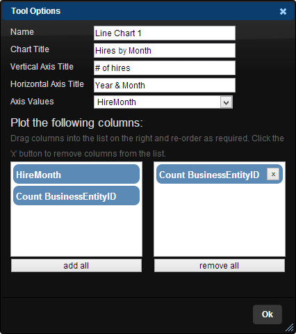
The Line Chart Tool draws a line chart of the data from its inputs. When you connect a line chart to an input and then open its options window, you will see this:

The tool's options window allows you to enter a tool name, a chart title, a vertical axis title and a horizontal axis title.
When it comes to plotting data, the tool asks that you specify which column to use for the horizontal axis values. You can then drag one or more columns into the list box on the right in order to plot the values from those columns. You can re-order the plot columns by clicking and dragging, or remove a plot column by clicking on the "x" button on the right of its list item.
If you decide to plot more than one series of values (i.e. column), then each series will be given a different colour and a legend will be shown on the results area.