Design is not a word you often hear associated with information reporting in a business environment. Most of the corporate reports I've seen are unsightly, chaotic and difficult to understand. They dump information on the viewer and expect them to make sense of it with no clues about how that data should be interpreted or where the interesting bits are hiding. It's up to the viewer to pore over the details and find the valuable nuggets that will make an impact on their business.
The reasons why reports end up like this are the subject of another article, but I'm a firm believer that businesses are loosing out by not putting more time into thinking through how their data is presented.
The state of information design
Outside of businesses, the world of data visualisation has been maturing over the past 20 years. There are some stunning examples of data reporting out there, but much of that development has been driven by scientists promoting their theories or by journalists creating engaging content that will sell ads. Businesses have, in large part, been left behind.
Business reporting does have different requirements though. While a data journalist is appealing to a large audinece that is only mildly interested in what they're reading. Business reports are looked at by only a few people who are looking for something that could ultimately get them a promotion, a bigger house or put their kids through university. So they really care about what the data is telling them.
The Goal of a Business Report
When a business manager reads a report, what they're looking for is very simple and can be summed up in two words:
Actionable. Insight.
The purpose of the report is to provide some kind of insight that prompts action within the context of their business. So, while the problem in data journalism is often “chartjunk” (visual bling that is unnecessary to conveying information), in business the problem is anything that gets in the way of an actionable insight. It could be unnecessary rows or columns, distracting design touches, or it could just be that you don't need a chart at all and a simple sentence would do.
It might be vaguely interesting to know that the majority of your customers prefer white wine to red, or drive a Honda, or that they have an average of 2.3 cats. But if you're business is selling light-bulbs then that is not an actionable insight. It's business reporting chartjunk.
Examples of Actionable Insight Reports
So what would my ideal business report look like. Here are a few examples:
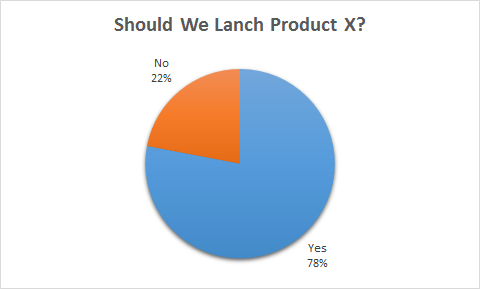
Here the actionable insight is that, unless your tolerance to risk is quite low, you should go ahead and launch the product.

Here the actionable insight is to talk to the people at Station E immediately, and then Station C if there's time.

Here the insight is to suggest cutting product 3 from the line, and to promote product 4 more heavily.

Here the actionable insight is to buy stock X until it reaches $3.50.
Each one of these reports provides an actionable insight that, if executed, could make the business more money, or prevent them from loosing money.
Of course, those same reports may have said that no action was necessary. That you should not launch the new product, that everything was running normally, that the margin on all your products was roughly the same or that the market was right about a certain stock price. In that situation the actionable insight would be to continue as you were. What makes the design of these reports good though, is that they enable you to get to that insight in a fraction of a second so you can get on with your day.
Start With the Right Question
You may notice that all the reports above answer a basic question. When you set out to design a report that provides an actionable insight, you realise that the report needs to address a central question. Once you understand what that question is, it becomes the yard stick by which you decide what should go in the report and what shouldn't. That, in turn, tells you how to design your report. Rather than listing columns or data points that the report should have, by simply stating the question clearly and then removing anything that doesn't help to answer it, you will get you to a well designed report.
It's not always that easy though, sometimes the brief is handed down from above and you just need to do as you're told. Sometimes the people asking for the report really don't know what the question is or should be. By pushing back and asking what question your answering, you may find that you transition from being a technical wizard who can make SQL do magic, to a business consultant who can challenge business leaders to think about what they're doing. It's not always appropriate to push back and ask what the question is, but it is always valuable to the business when you do.