Humans understand visual information 60,000 times faster than any other form of information. Think about how we use hand gestures to increase understanding when we communicate. That’s no coincidence. When it comes to processing information, visualizing data is king.
But it’s only now, after a few years of rapid internet growth and vast data creation, that data visualization is essential for business or product success. In the age of data-driven decision-making, those who can create and communicate actionable insights from their data analysis tools will succeed.
What is data visualization?
Simply, data visualization is the act of presenting information in a pictorial or graphical way. Bar charts, line charts, and pie charts are typical examples of data visualization tools in business.
 The pie chart: visualizing data for 200 years
At its core, data visualization has three purposes:
- Simplify data values
- Promote understanding
- Communicate important ideas and concepts
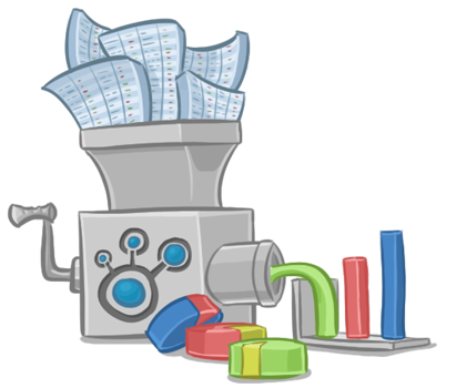
For many years, turning raw data into something meaningful has required technical experts who have deep knowledge of data science, databases, and programming languages. This has been made worse by a lack of accessible data analysis tools.
But data visualization tools are levelling the playing field. These tools allow anyone to intuitively create meaning from data by asking questions and receiving a visual output, empowering decision makers to make sense of big data themselves.
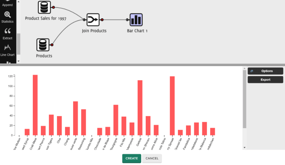 The simplicity of creating visual reporting in the QueryTree app
Data overload is driving the need for data visualization
You might be wondering why data visualization is so important. It’s simple.
By the time you finish reading this sentence four million people have asked Google a question. By the time you go to sleep Google has answered six billion queries. Everyday these numbers increase and more data is created. In fact, 90% of all data in the world was created in the last two years.
In short, data is being generated faster than it can be managed and analysed. And this trend is going to continue and grow exponentially. Businesses, small and large, aren’t exempt from this trend. Being able to actively interpret and use data will separate the future winners from the losers. Simple yet powerful data analysis tools are needed.
The days of trusty spreadsheet reporting are over.
The answer to understanding big data lies in visualizing data
The essential purpose of data visualization is that it enables you to create meaning from complex data, empowering you to make informed, agile decisions for the growth of your business or product.
Here are four simple ways visualizing data can help you create meaning from your data.
-
See the bigger picture
Spreadsheets and textual information are difficult for us to interpret because they work on the basis of individual data points. Data visualization turns these individual points into something whole that the human brain can quickly grasp.
The graph below takes individual data points from decades worth of data and visualizes them, transforming them into a coherent story that you understand at a glance.
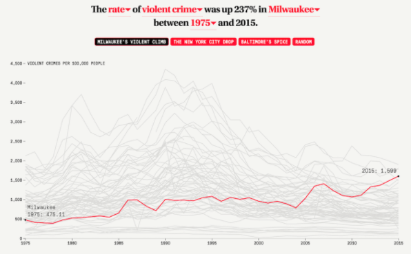 The different trends in American crime, Flowing Data
-
Present complex data in a universally understandable way
Traditionally, data has been hard for non-experts to comprehend or interpret. Data visualization tools allow complex data to be easily presented and understood.
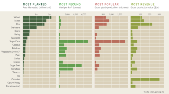 What is the world's biggest cash crop?, Information Is Beautiful
By simplifying data into digestible visual information, it’s simpler to communicate the story and its impact.
-
Identify relationships and patterns
By visually representing data it becomes easy to spot patterns or relationships. In a spreadsheet, data are meaningless numbers with hard-to-see relationships.
This is what spreadsheet data look like:
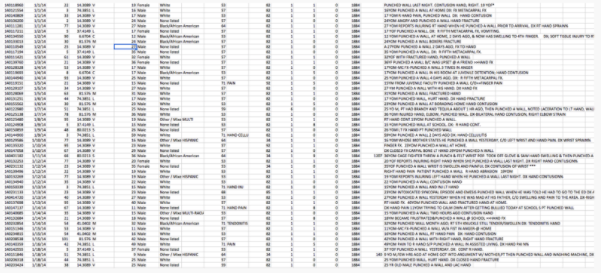 Raw spreadsheet data regarding injuries in America, Quartz
This is what the information above looks like following visualization:
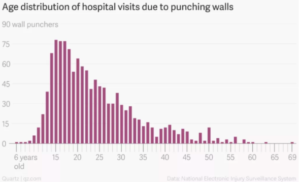 Age distribution of hospital visits due to punching walls, Quartz
Visualizing data instantly shows patterns and relationships.
-
Deep forecasting and emergent trend analysis
Data visualization isn’t just about understanding what’s already happened. It can also be a powerful tool for forecasting and pinpointing emergent trends.
In New Orleans, following a house fire where there was no smoke alarm, the city analytics team developed a model to predict which blocks were most at risk.
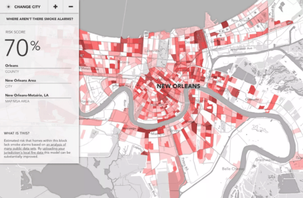 Forecasting the risk of house fires in New Orleans, Flowing Data
The model turned existing raw data into a visual representation of potential risk zones, mapped out onto a city plan, to inform future planning decisions.
Harness the power of data visualization
The rapid growth of big data won’t be stopping any time soon. In fact it’s set to increase. Businesses small and large need to harness the power of the data they’re creating.
Data visualization tools remove barriers to successful data analysis. It’s never been easier to create meaning from your data with these data analysis tools. Those who manipulate these tools will turn data visualization to their advantage and forge ahead in the data-driven future.
Easy data reporting and visualization
Think data visualization can help you gain valuable insights into your business or product?
QueryTree is a powerful yet simple reporting tool that allows anyone to gain insight from their product or business data, without the need for any technical understanding. With a drag-and-drop builder and tonnes of visualization options, reports can be generated on the fly, or scheduled and emailed to team members, directors, and investors - on the web or on your mobile, and without you sacrificing hours of your time.
Sound good? Build your first report with QueryTree, free for 14 days.